Common iOS Paywall Rejections And the Fixes That Work


Quick Summary
App Store paywall rejections (especially Guideline 3.1.2) can feel brutal because Apple often gives vague feedback. In early 2026, Apple started rejecting a lot of apps using toggle-based free trial designs or unclear subscription flows.
The core issue: Apple believes these paywalls confuse users about pricing, trials, and auto-renewal. Many rejections happen due to small but critical mistakes like hiding trial details or missing Terms/Privacy links inside the app.
This guide breaks down the biggest paywall pitfalls and gives you clear examples and fixes so you can redesign your paywall and pass review.
Top Reasons iOS Paywalls Get Rejected.
Apple’s Subscription Guidelines (3.1.2) are tough on clarity and fairness. Any hint of a “trick” or missing info can trigger a rejection. The most common paywall sins are:
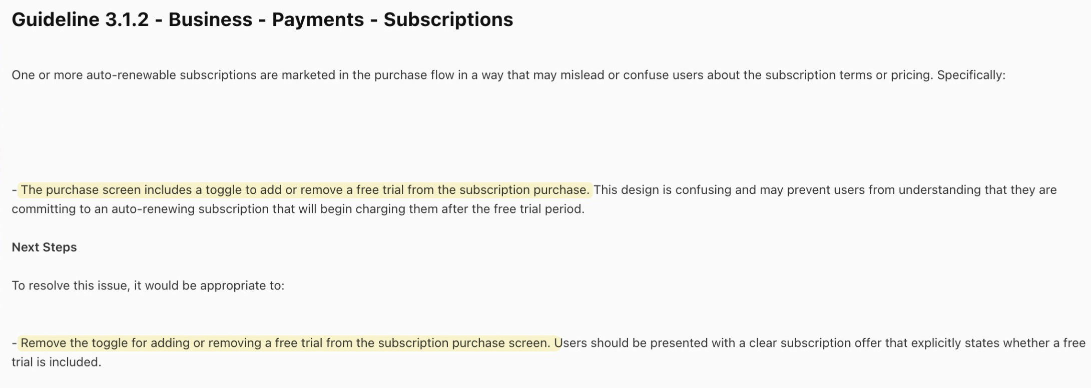
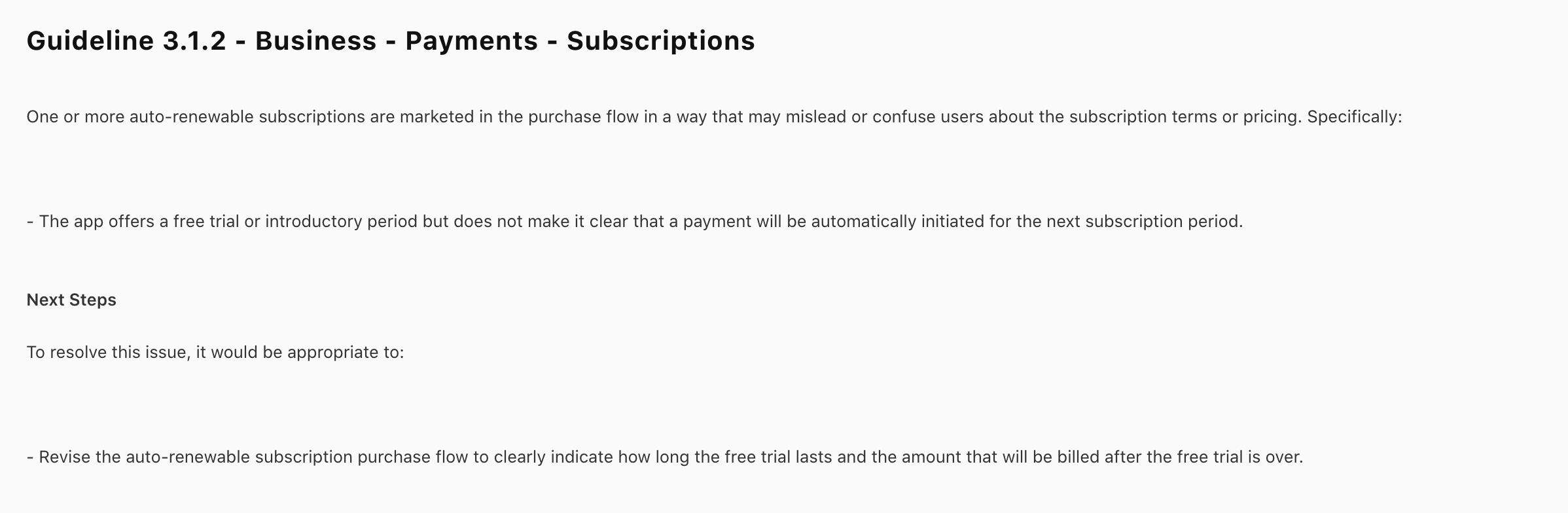
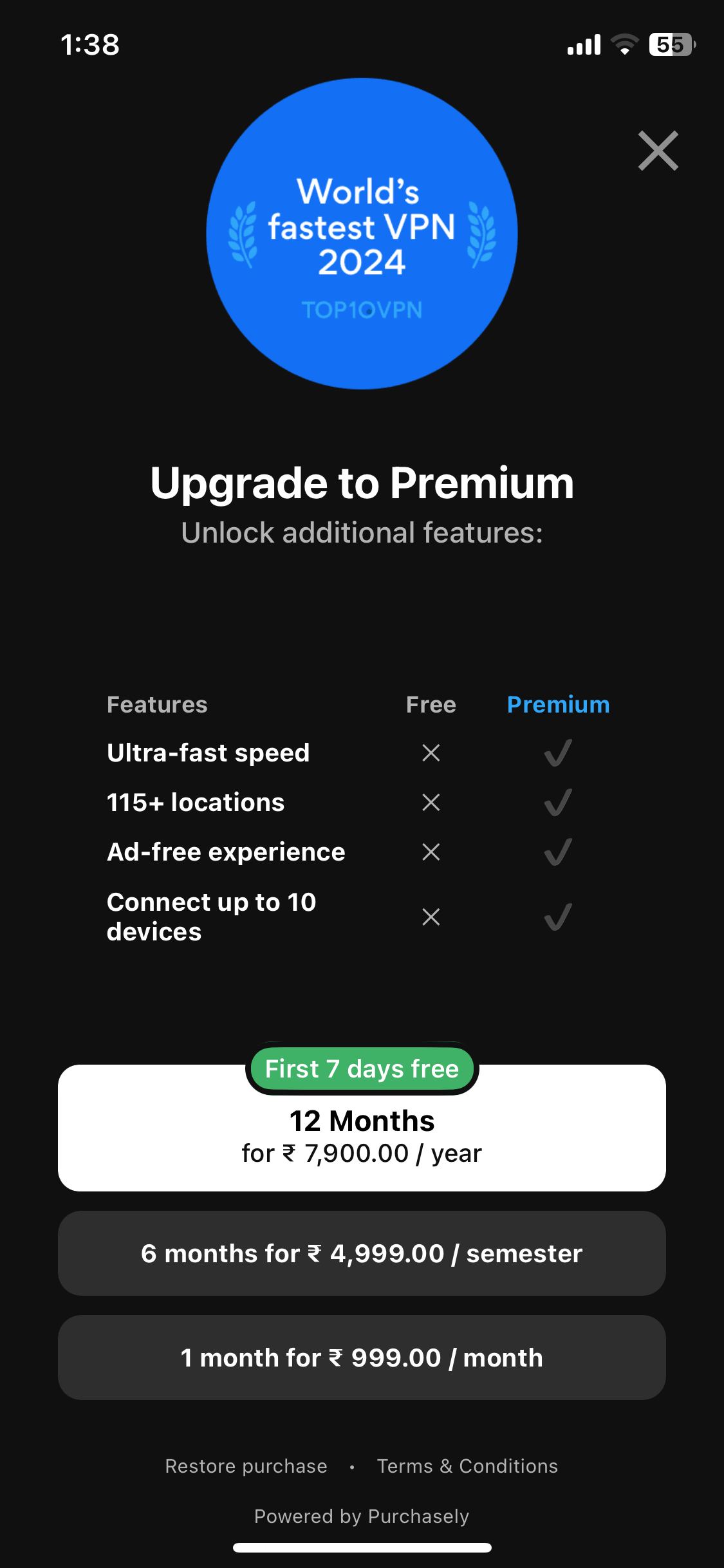
Hidden or confusing free trials.
Apple specifically targets paywalls with a toggle that hides a free trial by default. In practice, this meant showing users a low annual price unless they flip a switch for a trial period. Apple’s message is clear:
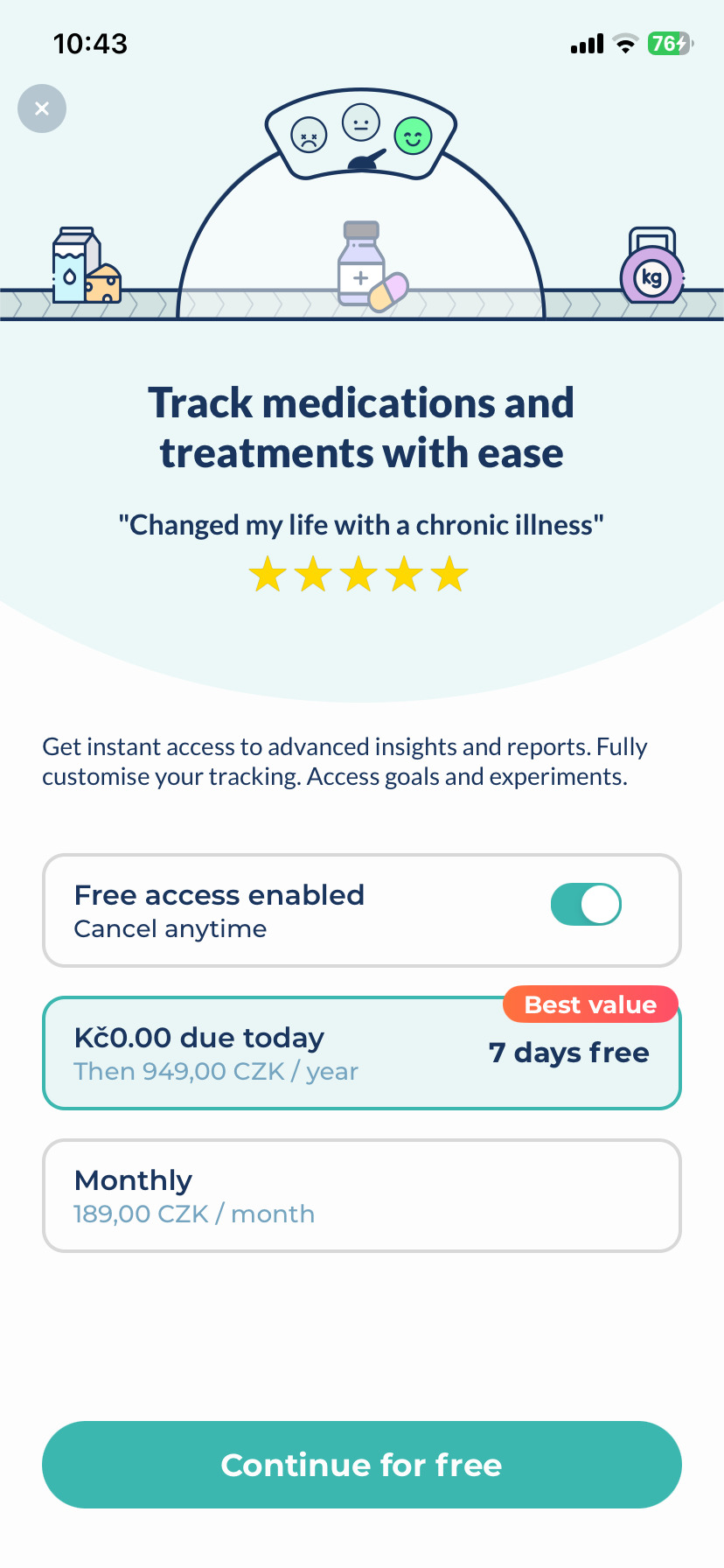
This design is confusing and may prevent users from understanding that they are committing to an auto-renewing subscription…
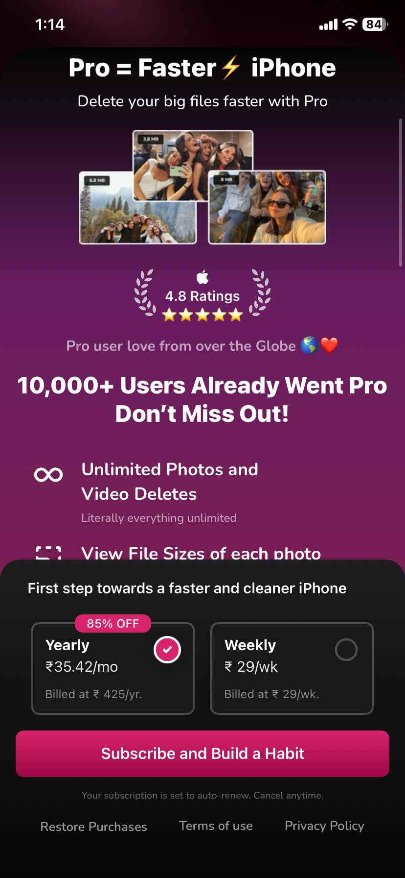
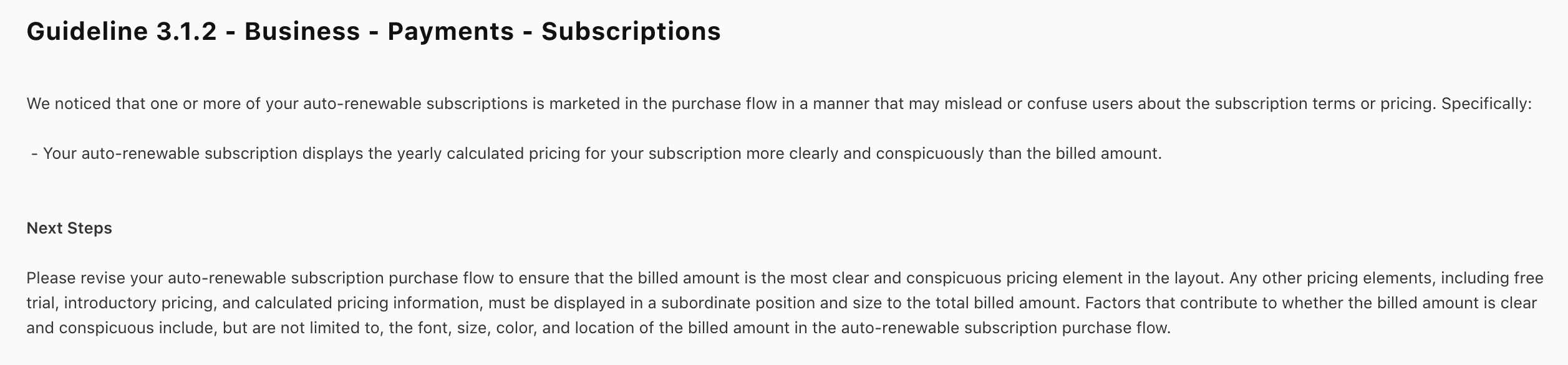
Unclear price or billing info.
If price, billing period, or trial details aren’t prominent, App Review will flag it.
Apple expects the price and billing period to be shown clearly on the screen.
A common rejection is subscription length and price not prominent enough.
For example, showing $4.99/month in big text while the product is actually $59.99/year, billed annually will be treated as misleading.
Make sure every subscription tier shows the actual billing amount and term in large, readable text (at least 16pt), and consider adding an info icon or short footnote for extra details.
Missing legal links (Terms, Privacy) inside the app.
For auto-renewing subs, Apple requires Terms of Use and Privacy Policy links in the app UI itself – not just on your website or App Store page.
Missing Restore Purchases button.
Apple’s checklist explicitly expects a restore option on any paywall. If a user reinstalls or switches devices, they need a way to restore an existing sub.
False or unsupported claims.
Apple also watches for exaggerated marketing. Don’t promise things you can’t guarantee or call a paywall “free” when it charges after a trial.
Misleading claims can trigger compliance issues. Stick to simple, truthful copy Start with 7 days free, then $9.99/week, auto-renews.
Takeaway
Keep the paywall honest and transparent. Clearly label everything the user is committing to. Provide backup options (restore, cancel instructions). Don’t trick or gatekeep users. If in doubt, imagine a skeptical user or Apple reviewer: is the paywall crystal-clear? If not, fix it.
The Anatomy of a Compliant Paywall
A compliant paywall shows all the info up front, provides the right buttons, and uses approved APIs.
Product names and durations.
Each row should say exactly what the user is buying (e.g. “Premium Yearly – 1-year subscription”). Don’t abbreviate the billing period.
Price and billing period.
Display $9.99/month or $59.99/year in bold. Apple’s checklist explicitly expects the price and billing period shown. If you offer a trial, add text like first 7 days free, then $0.99/week right below the price.
Offer badges.
Tag the best value plan with a Most Popular or Best Value badge. Recent analysis found that showing an annual plan with a large font and a Most Popular ribbon preserved price anchoring lifts. In other words, design elements like badges help guide choices legally.
Bonus: Design Tips That Also Improve Conversions
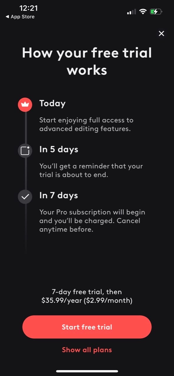
Detailed trial explanation.
If you offer a trial, clarify it. Apple recommends making the trial timeline explicit (e.g. “Day 1–7: Free trial, then $0.99/week”).
A good practice is a small infographic or list describing:
Day 1: Start trial (free)
Day 7: Subscription renews for $X.
If you need inspiration, Find the timeline style paywall below increased conversions by 23% once made transparent.
In short, make your paywall honest and helpful. The best paywalls make users want to subscribe, rather than trick them. By front-loading value, using clear labels, and showing the full price up-front, you both satisfy Apple and often lift conversion. Apple’s crackdown on “dark patterns” means that a bit of extra candor can actually work in your favor long-term.
Show an offer paywall on dismissal
When users dismiss your paywall, don’t just close it, show a smarter fallback offer like a discounted price, longer free trial.
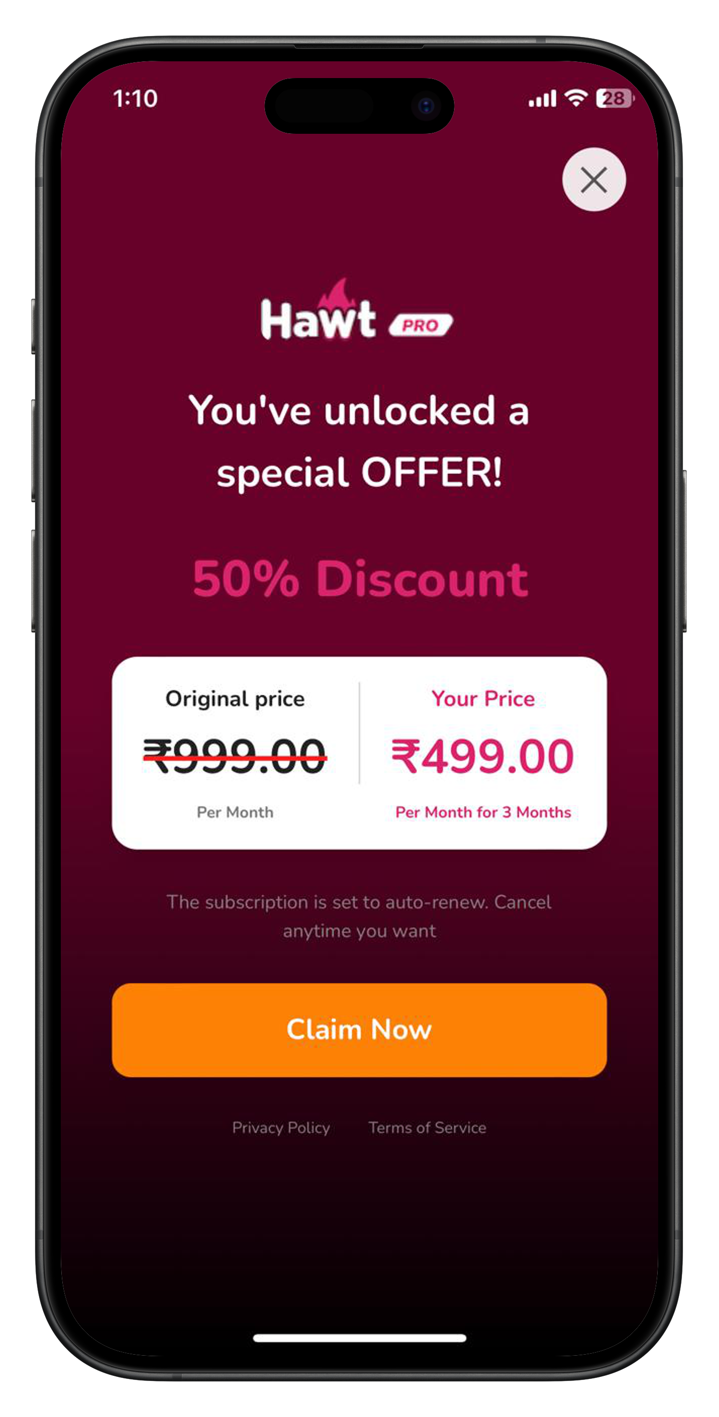
With RevenueFlo, you can control this remotely anytime (enable/disable or swap the offer) without shipping a new app update.
Conclusion
Paywalls can make or break your subscription app. Follow Apple’s rules and your App Review woes vanish. By showing clear pricing, trial details, and legal links, and removing any “tricks” (like hidden toggles), you satisfy Guideline 3.1.2. Better yet, these fixes usually boost conversions too.
With our clients, simply adding the missing links unlocked approval. In others, adopting timelines and badges preserved the strong revenue lifts of past strategies without risking rejection.